I got sick of working on the computer, so I did some cut out/ collage experimentation.
Printed off photos of Trump, gold and a barcode from the internet and cut out some letters out of black card and basically played around to see what works and what doesn't.
The letters are just rough for just now, will make better - this is my own made up type. I like it because it makes the magazine look fun, I like the letter V being an upside down triangle and the P and O not having extra holes in it, I think it makes it more interesting rather than plain Arial or something. Plus it is my own magazine so I think I should make up my own type.
 |
| Started with a very simple combination - boring. |
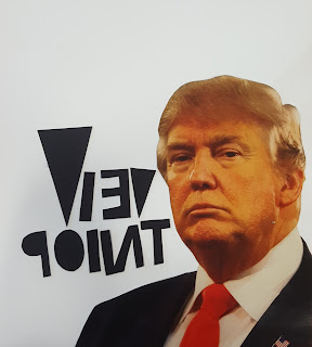 |
| Reversed letters is something I really like in this sense. |
 |
| Letters running along the shoulder, trying to make it fit in more. |
 |
| A bar code is needed, covering Trump's eyes to make him look unimportant. |
 |
| Slightly neater looking- in the corner. |
 |
| Different combinations. |
 |
| Got some of Trump's favourite materials in there. |
 |
| Bit cluttered. This is inspired by Trump's idea of building a tower made out of gold with his name on top of it. |
 |
Peeking from behind the gold, that's all he really is.. stupidly rich, that's all, nothing else.
That's what Trump looks like in my eyes. I like the arrangement in this one. |
 |
| Some extra gold on his head. |
 |
| I think this one if perfect for a from cover of my magazine. Love it. |
 |
| More gold, again. Too much gold. |


0 comments:
Post a Comment