Home
Archive for
November 2015
Gerhard Richer is a German painter who originally trained in a realist style and later developed an appreciation to the more progressive work of his American and European contemporaries.
Richer often uses photographs to then work over, he even uses photographs from his own family albums to then 'over paint'.
This print by Gerhard Richer is called "Kerze II" (1932) kerze translating to candle.
It is an offset lithograph in colours and painted over with black oil paints.
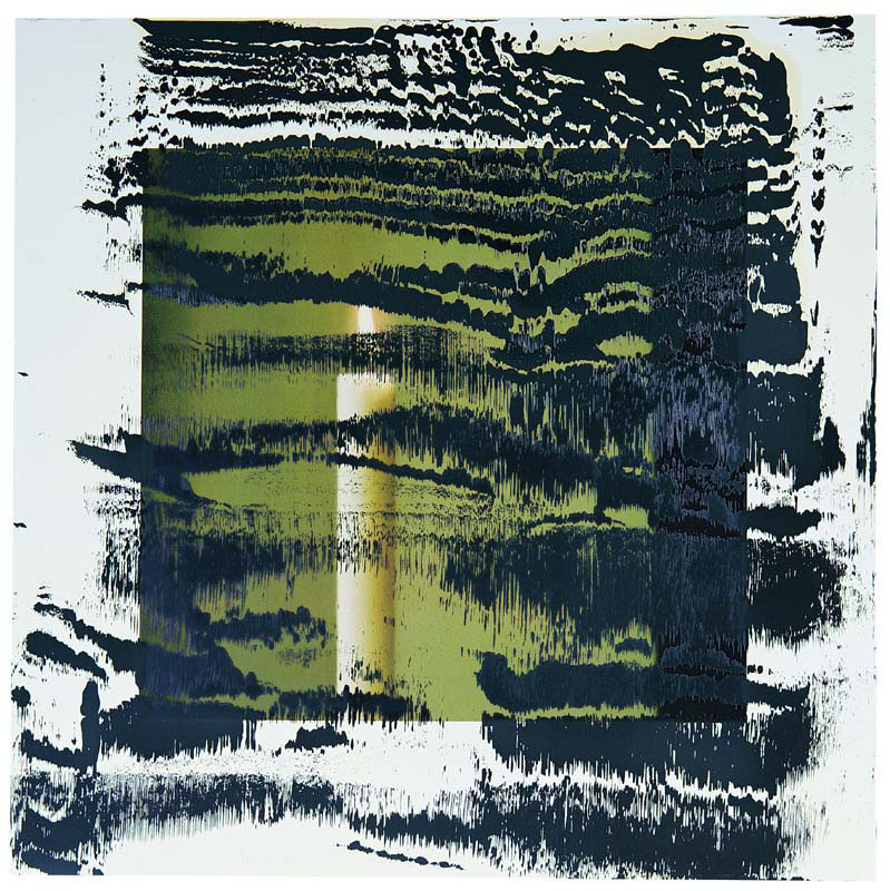 Me being clueless in what message Richer is trying to get across by his over painting techniques, I am a fan of all his art works.
This print makes me think of darkness taking over the light. As the candle only has one little flame that lights up, all this ink and paint can easily put it out.
The patterns of the ink and paint seem to resemble a scenery or could possibly have no subject matter at all.
There isn't much else I can say about this print apart from stating that I like the effect if creates, first your eye concentrates on the ink and paint and you assume it's a mess but as you look it starts to take on a pattern and make more sense, it is not until later on that you realise the candle, which is ironic as the candle is meant to set off a bright light.
Me being clueless in what message Richer is trying to get across by his over painting techniques, I am a fan of all his art works.
This print makes me think of darkness taking over the light. As the candle only has one little flame that lights up, all this ink and paint can easily put it out.
The patterns of the ink and paint seem to resemble a scenery or could possibly have no subject matter at all.
There isn't much else I can say about this print apart from stating that I like the effect if creates, first your eye concentrates on the ink and paint and you assume it's a mess but as you look it starts to take on a pattern and make more sense, it is not until later on that you realise the candle, which is ironic as the candle is meant to set off a bright light.
Trevor Allen was a printmaker born in 1939 in Portsmouth. This is one of his prints, it is called "Lovers" and was made in 1966, art in the 60's was highly influenced by vibrant colours, flower power, love and peace. Presumably that is where the title "Lovers" came from along with the vibrant blue highlighting the figures.
This print is a reduction colour lino cut, it seems to be quite abstracted and slightly surrealism inspired, the blocks of imagery even remind me of cubism slightly.
There are many different forms in this print, it gives the impression of more of a collage than an image as a whole, there are shapes separating different colours and textures from one another. Each box of colour contains a different texture. The dominant image is a vibrant blue colour which contrasts from the rest of it, that being figures of a couple kissing. In my opinion it looks like the couple are emotional and in love, lying on a bed looking at the stars. But the print is not very obvious due to it's abstracted forms so it may have more than one interpretation. I like this print, it tells a story, at the same time it doesn't make sense and its hard to figure out and that is what makes it interesting.

Wassily Kadinsky was born in 1866 and died in 1944. He was the central figure in the development of 20th century art and the pioneering theorist of abstraction.
This painting by Kadinsky is named "Watercolour No.14" painted in 1913
 This painting was made with watercolour paint and ink on paper.
It is very abstracted, as most Kadinsky's works are, It gives me the impression of it being an automatic drawing - where you close your eyes and draw/paint whatever comes into your mind and then open your eyes and work on it. I have recently tried one in class and it is what it reminded me of, I may be wrong. It is expressionism so Kadinsky was expressing what he felt at the time, this painting has a different meaning to everyone as we all think differently so it is hard to tell what it meant to Kadinsky. It seems as if he used the watercolour paint first then worked on the painting with ink to add detail.
In my opinion this painting is very rough and quickly done, however I love the parts there is very light watercolour patches, they make a beautiful delicate and abstracted background.
Now I am going to move on to Otto Dix, another very influential German expressionist.
Otto Dix was German and born in 1891 and died in 1969. Exactly like Wassily Kadinsky he was a painter, printmaker and water-colourist.
Otto Dix was most known especially for his caustic portraits of post war German society.
This painting by Otto Dix is titled "The Nun" painted in 1914.
This painting was made with watercolour paint and ink on paper.
It is very abstracted, as most Kadinsky's works are, It gives me the impression of it being an automatic drawing - where you close your eyes and draw/paint whatever comes into your mind and then open your eyes and work on it. I have recently tried one in class and it is what it reminded me of, I may be wrong. It is expressionism so Kadinsky was expressing what he felt at the time, this painting has a different meaning to everyone as we all think differently so it is hard to tell what it meant to Kadinsky. It seems as if he used the watercolour paint first then worked on the painting with ink to add detail.
In my opinion this painting is very rough and quickly done, however I love the parts there is very light watercolour patches, they make a beautiful delicate and abstracted background.
Now I am going to move on to Otto Dix, another very influential German expressionist.
Otto Dix was German and born in 1891 and died in 1969. Exactly like Wassily Kadinsky he was a painter, printmaker and water-colourist.
Otto Dix was most known especially for his caustic portraits of post war German society.
This painting by Otto Dix is titled "The Nun" painted in 1914.
 This painting was done by the use of oil paint on cardboard.
This painting is reflecting on the emotions of a nun during the start of World War 1. Presumably influenced by Cubism as of the edgy head wear- it looks like it is painted from different viewpoints just like in Cubism. The bright vibrant colours are really expressing strong emotions in the nuns face, emotions of fear, hopelessness and grief. The figure on the right of the nuns face appears to be a thought that the nun is having, either a memory or a thought of someone close to her. The left side of her face is however hard to make out but I would assume that it is an expression of what is on her mind. Otto Dix seems to have gathered influence from the Fauvist movement due to the effect that the colour scheme shows, giving the portrait a wild beast look.
This painting was done by the use of oil paint on cardboard.
This painting is reflecting on the emotions of a nun during the start of World War 1. Presumably influenced by Cubism as of the edgy head wear- it looks like it is painted from different viewpoints just like in Cubism. The bright vibrant colours are really expressing strong emotions in the nuns face, emotions of fear, hopelessness and grief. The figure on the right of the nuns face appears to be a thought that the nun is having, either a memory or a thought of someone close to her. The left side of her face is however hard to make out but I would assume that it is an expression of what is on her mind. Otto Dix seems to have gathered influence from the Fauvist movement due to the effect that the colour scheme shows, giving the portrait a wild beast look.